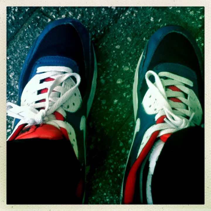
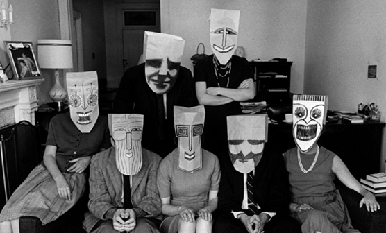
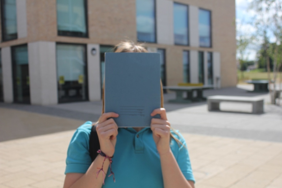
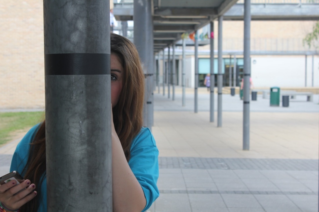
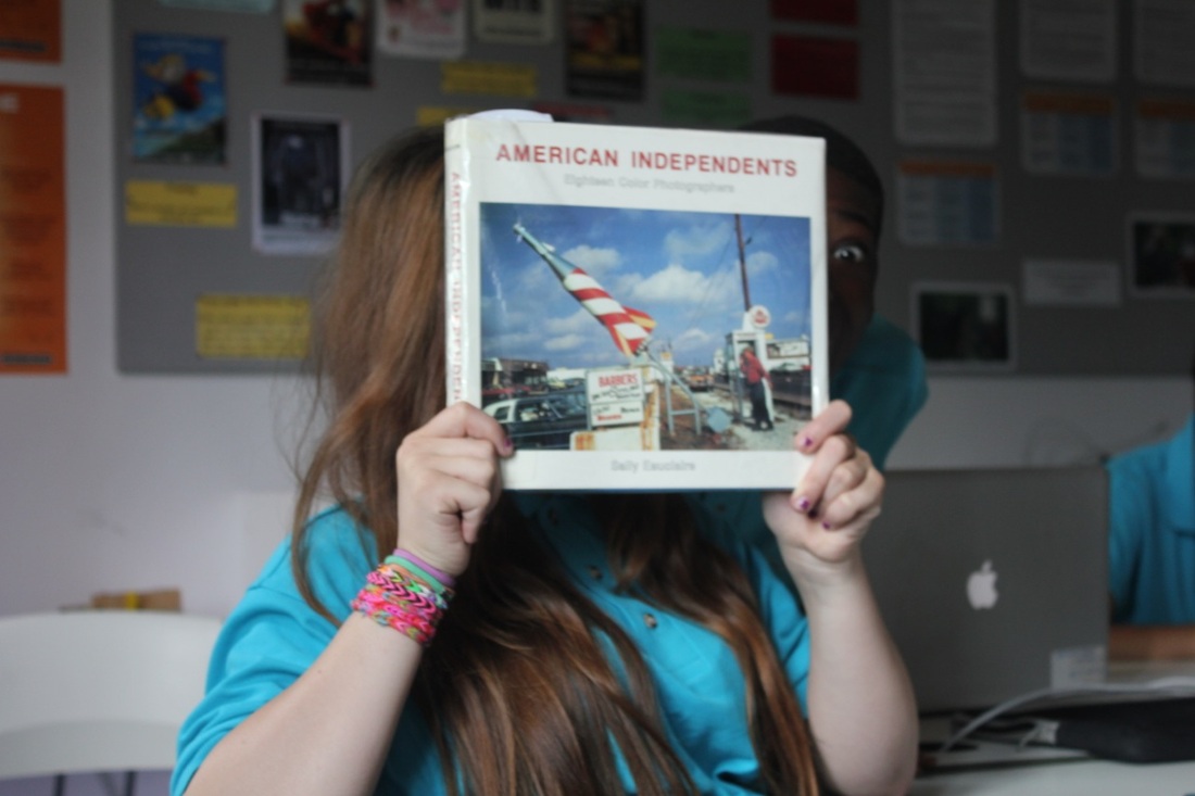
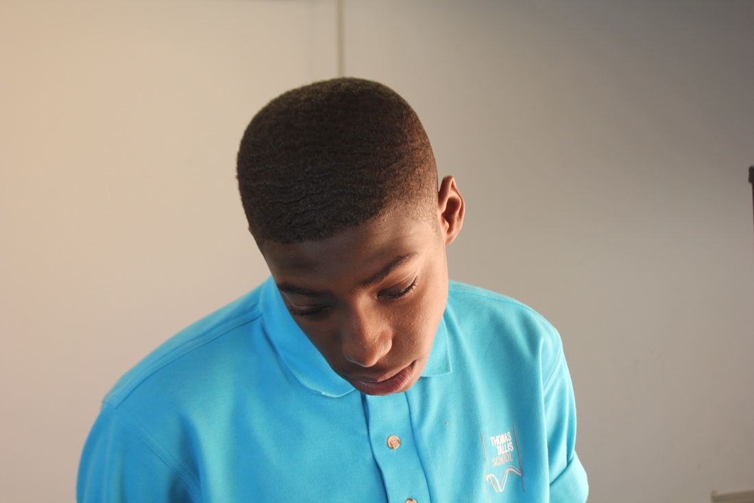
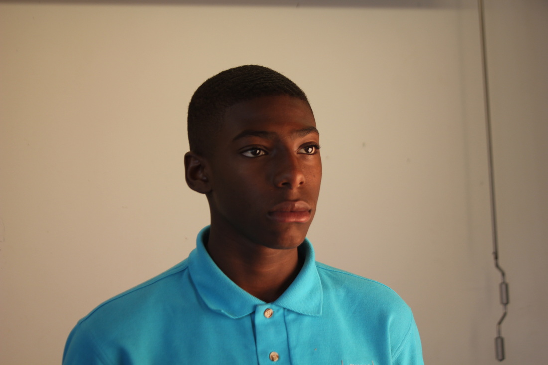
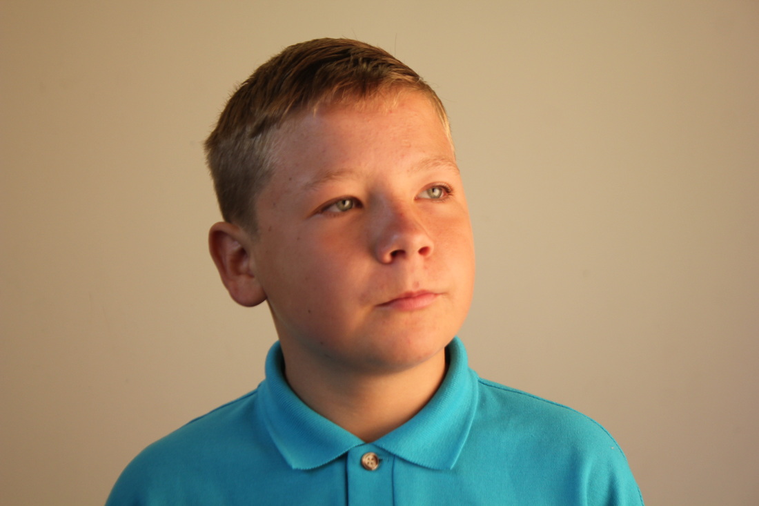
images set- 1

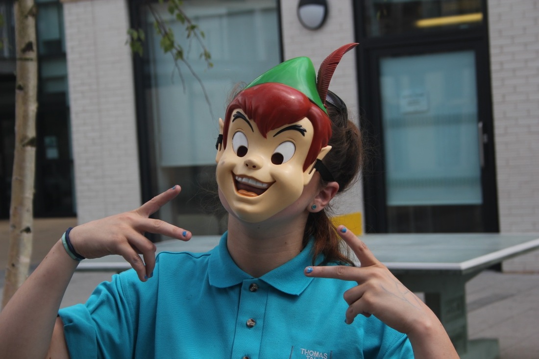
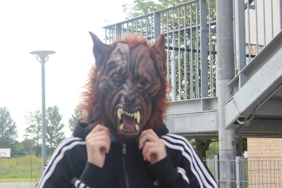
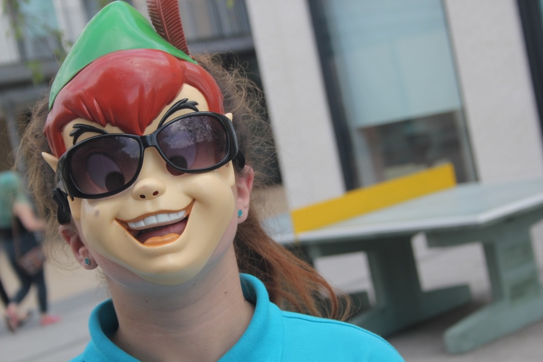
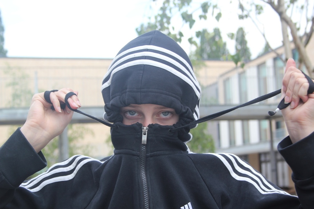
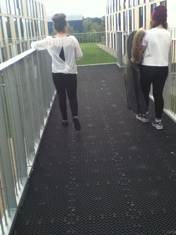
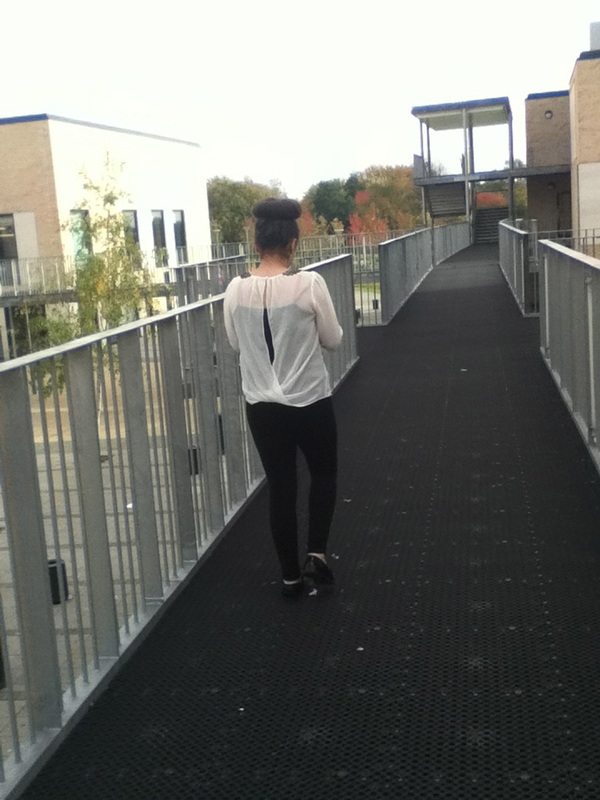
WWW: what went well is that i had a lot of different types of ideas
EBI: if i could use different levels high and low and some in focus and some out.
EBI: if i could use different levels high and low and some in focus and some out.
Saul steinberg
Saul Steinberg is an American cartoonist and illustrator , he describes himself as a writer who draws. He also submitted his carttons and refined his exhibition work in museums. He was given commissions for newspaper and sold cartoons his first cartoon was published in 194. Through half a century working with 'The New Yorker' , Steinberg created 87 covers , 33 cartoons and 71 portfolios containing 469 drawings.
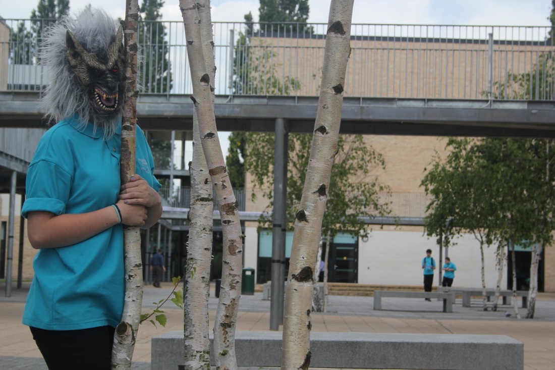
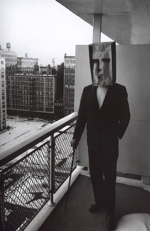
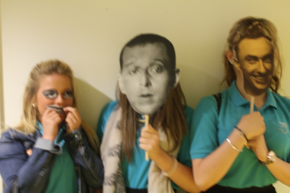
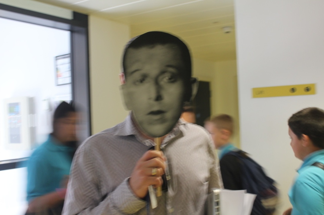
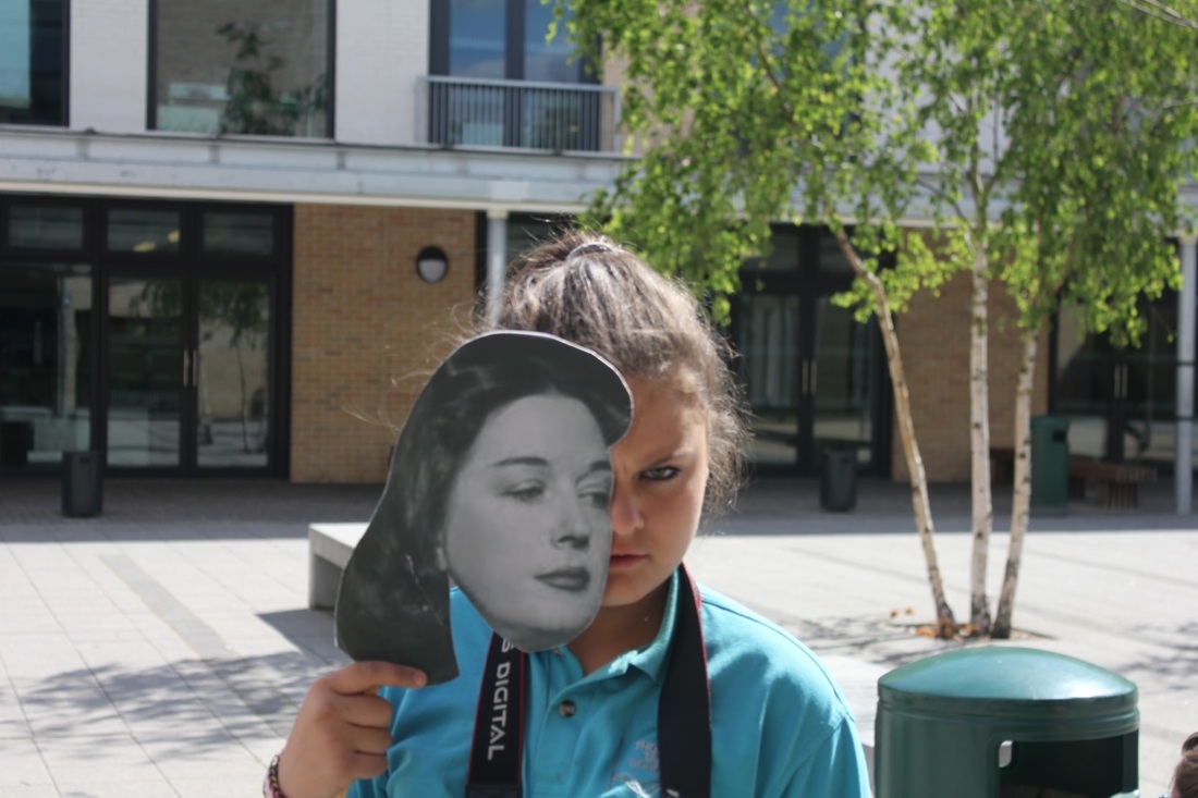
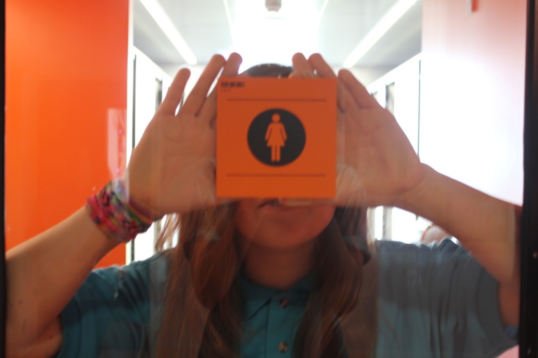
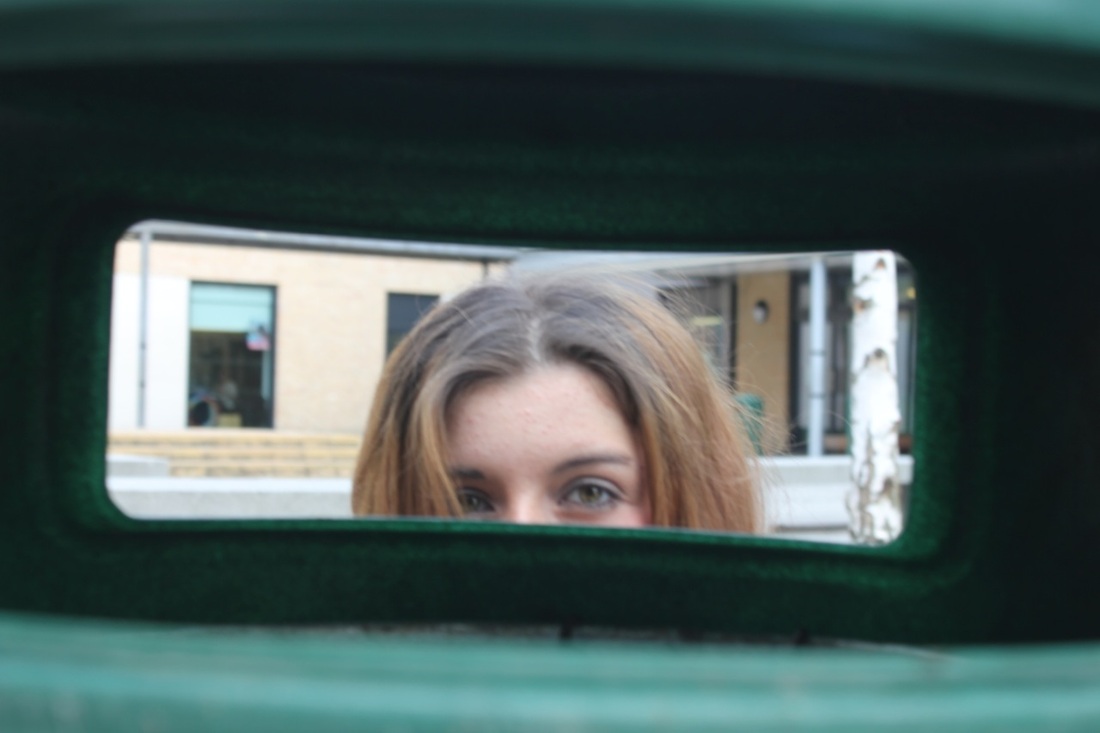
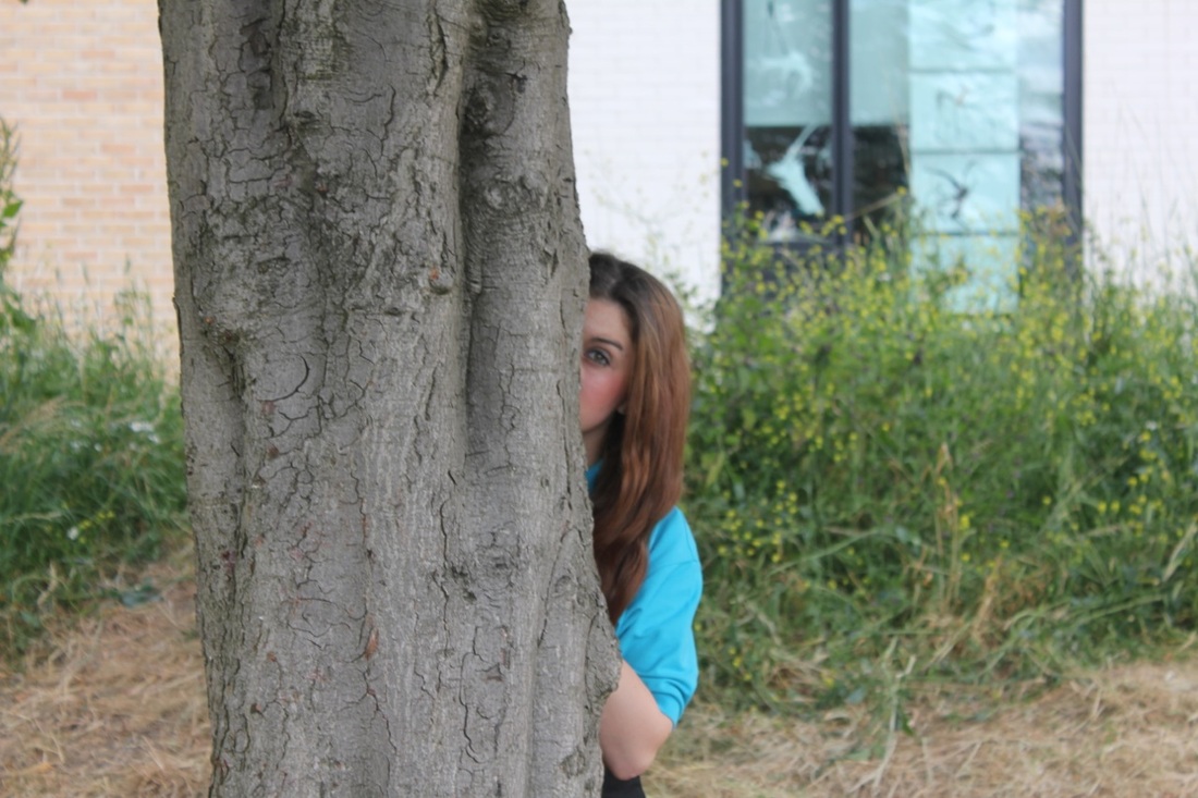
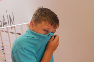
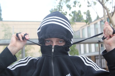
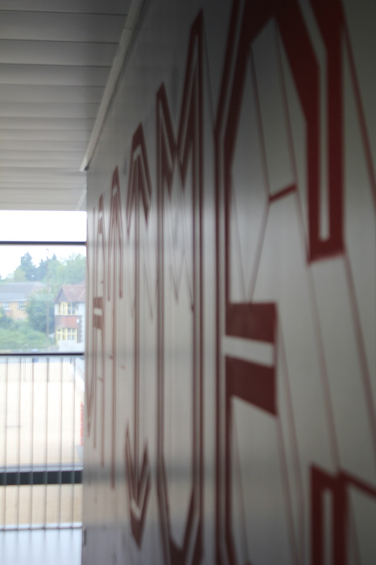
Image Set- 2


|
|
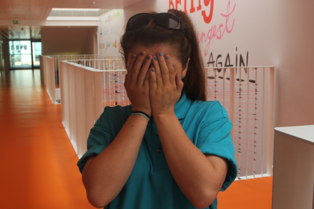
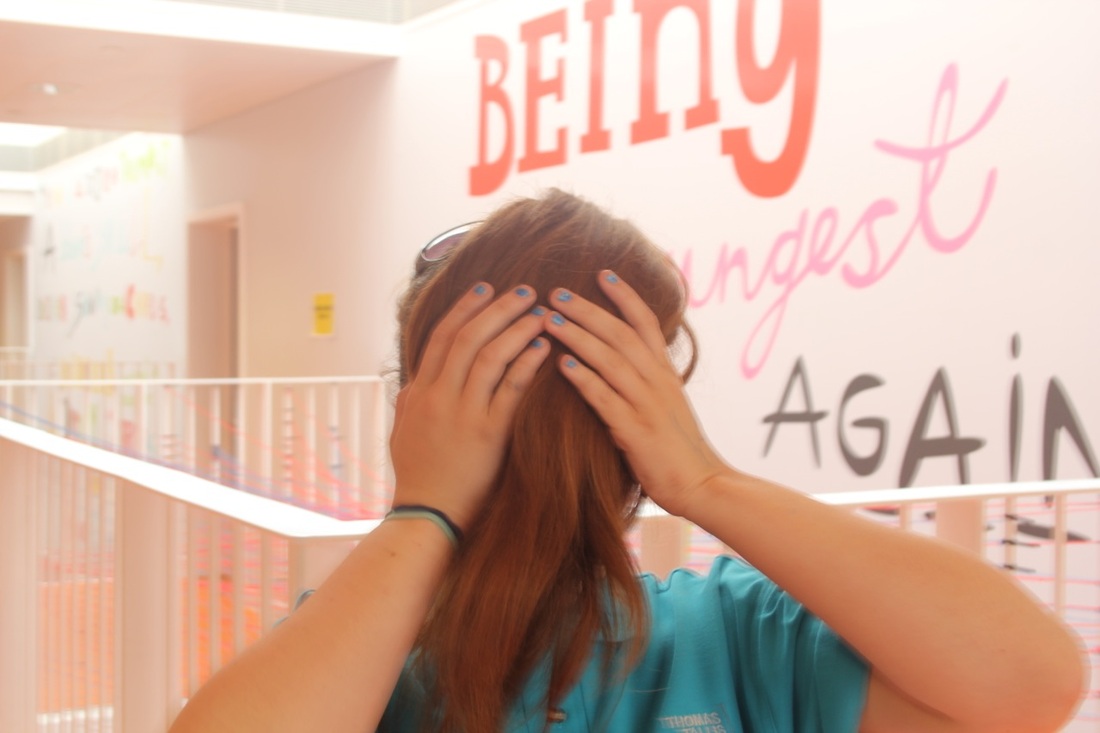
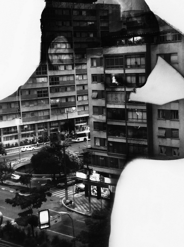
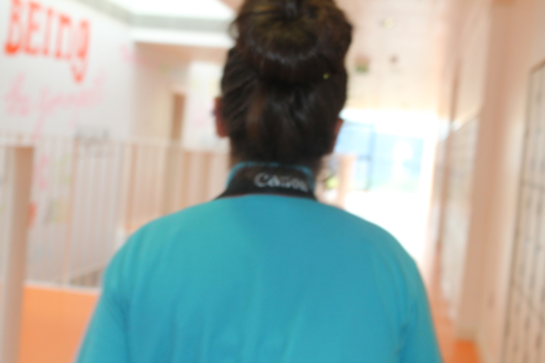
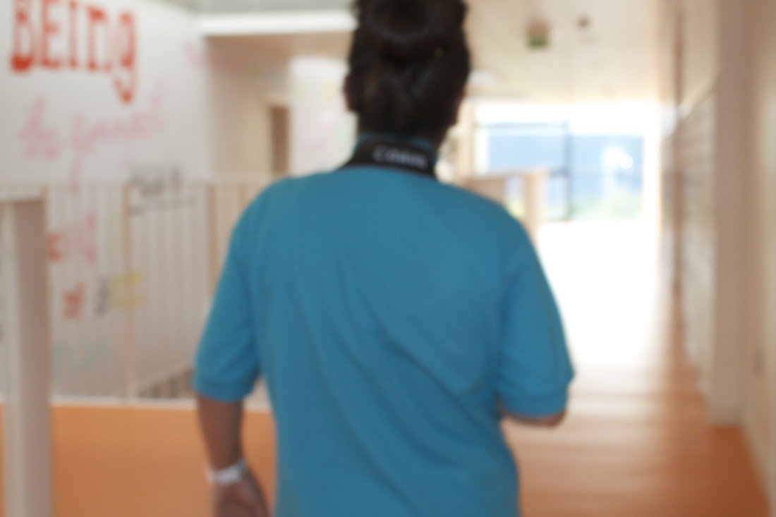
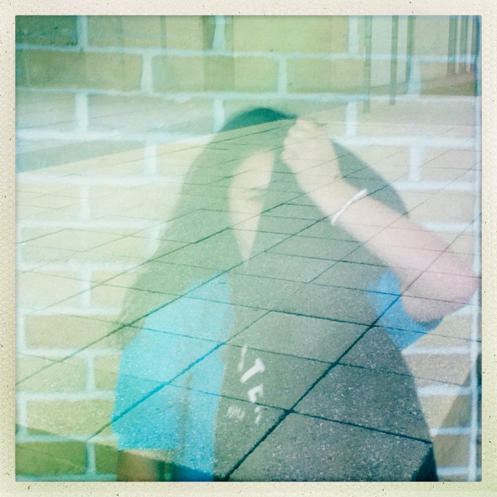
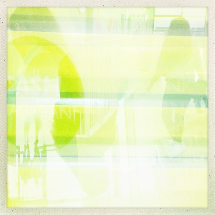
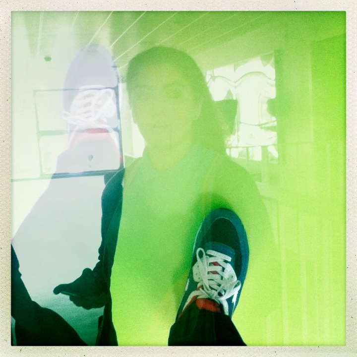
These two images are my favourite because one reason is they go together and relate they are similar pictures another reason is because they are clever ideas I am going to do more pictures like this but to improve I will make sure they are all in focus and use many different objects to hide behind.
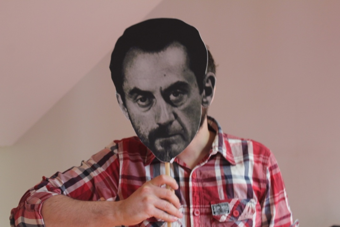
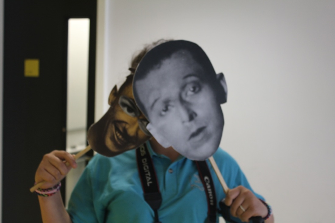
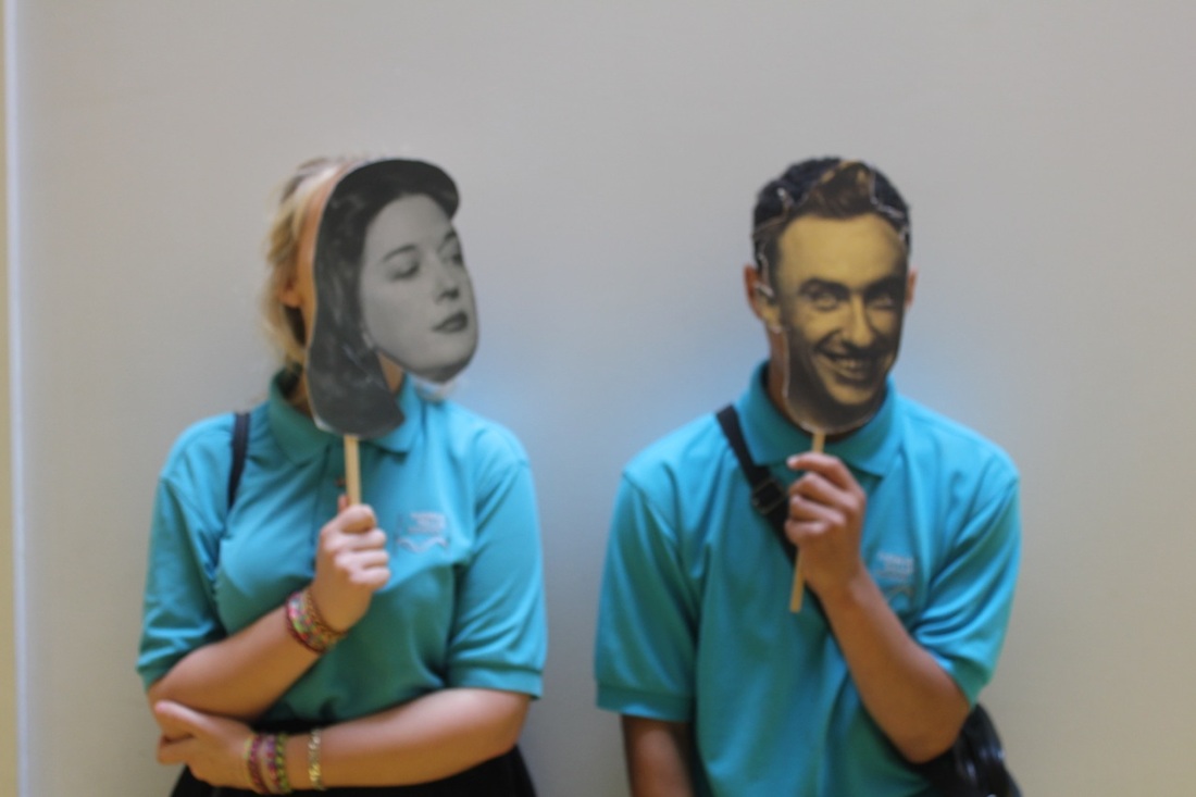
Images Set- 3
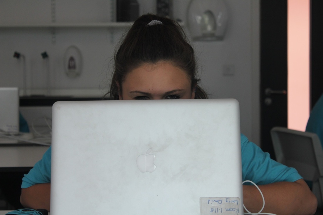


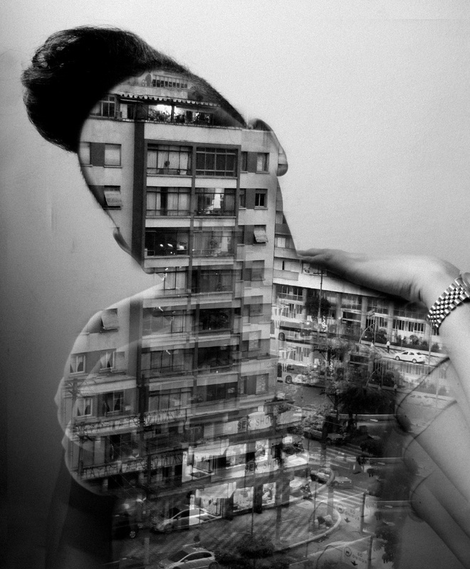
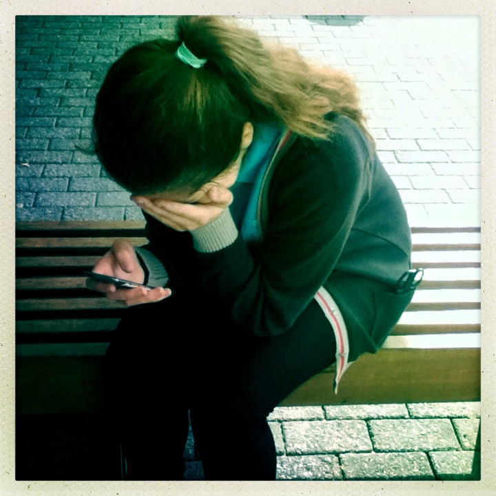
My Final Piece


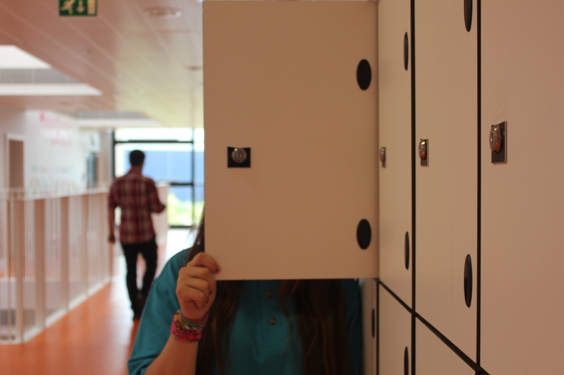
I choose these for my final piece because I find these as my best pictures and they all also relate in the same kind of way this worked better than i thought, But the main reason of what went well are is I managed to get all good pictures and put them together but if I had the chance to do it all again i would make sure all the pictures are in focus and try more different ways to achieve my target and make more pictures to put together with the ones I have.
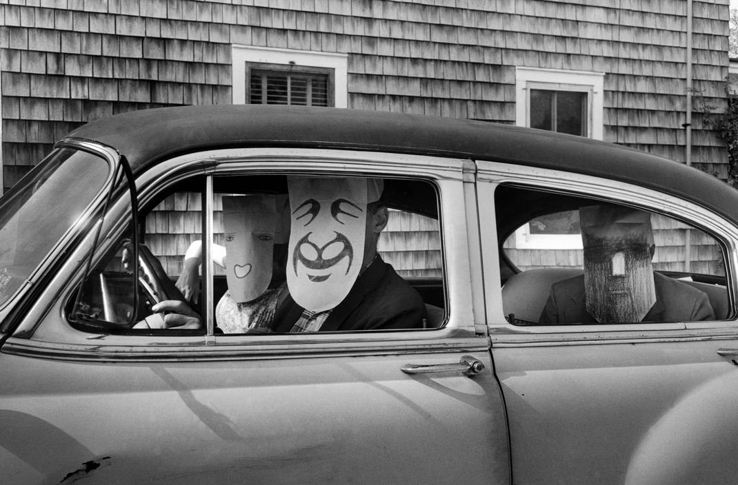
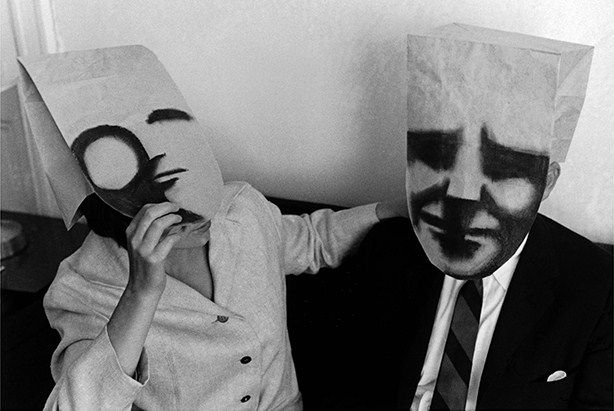
Pinterest - Disguise
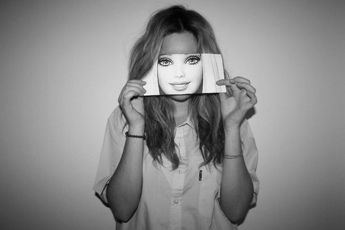
- I got these off Pinterest and I like these pictures for many reason such as my first reason for the first picture is that this picture gives the idea to girls and people that use social network that you HAVE to be perfect like barbie and people will only love you if you are like her. Another reason is she is the main kind off idol that girls find they have to try be like which is; blonde , blue eyes, skinny.
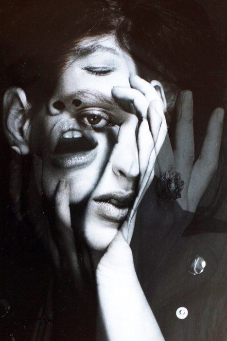
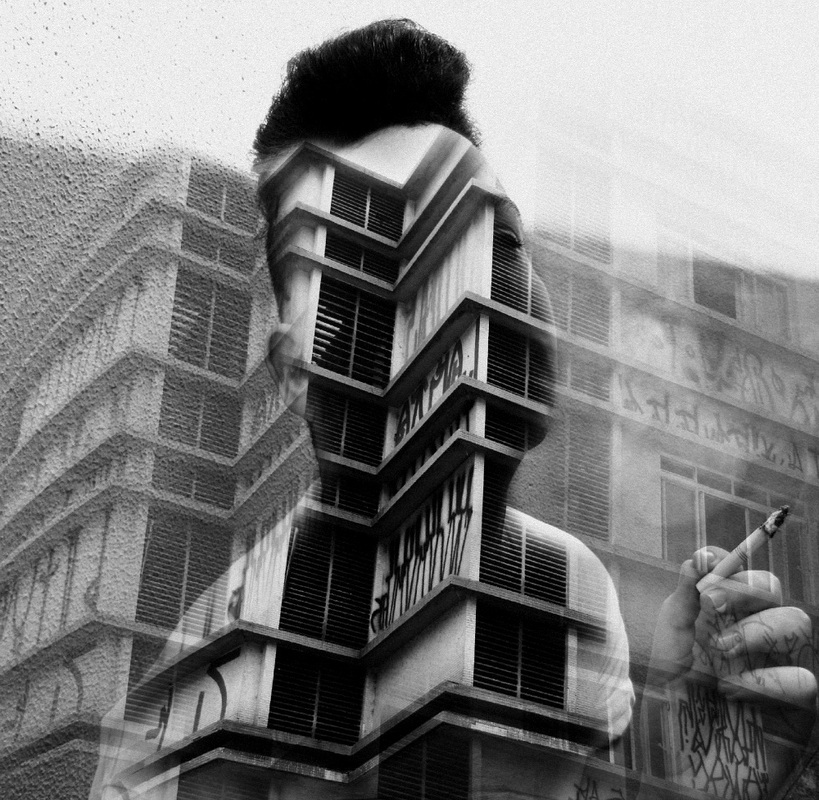
- My first reason for the second picture is that it caught my eye and the fact for that is because that it has a person with other peoples facial features such as the mouth kind of overlaps her or his eye but at the same time you are able to see both images almost like it is transparent at the same time. Another reason is because the effect of the image is in black and white showing that it may be a old piece of art or maybe just a way to make it stand out.
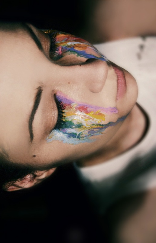
- Lastly my reasons for the last picture is it is creative and shows a girl crying but it isn't a picture many people use to show their emotions which makes the picture quite special and makes you wonder why they use this type of way to express them self. Secondly the colours also caught my eye because when you cry its only water and has no colour but this picture shows quite dull colours almost again expressing that she may be depressed or upset and has no one to talk to but it also may be happy tears and the colours showing happiness that she's happy over something.
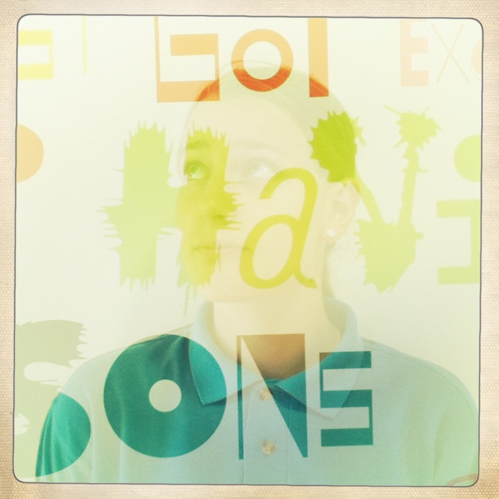
My next idea to create a image is of the middle picture and to play about taking pictures and using photoshop like that picture or printing out lots of pictures and sticking them so they overlap over each other. I am also now researching a person called Matt Wisniewski who does pictures like disguise and many ones like the middle picture.
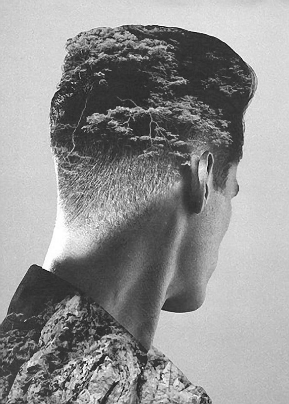
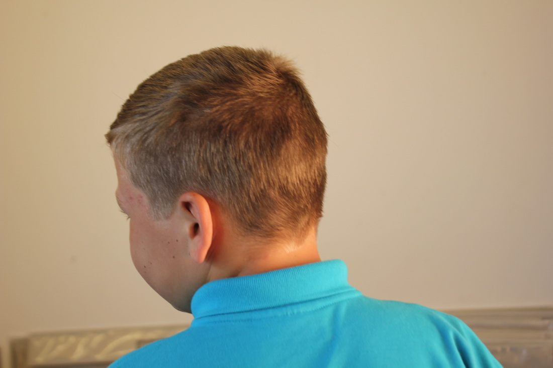
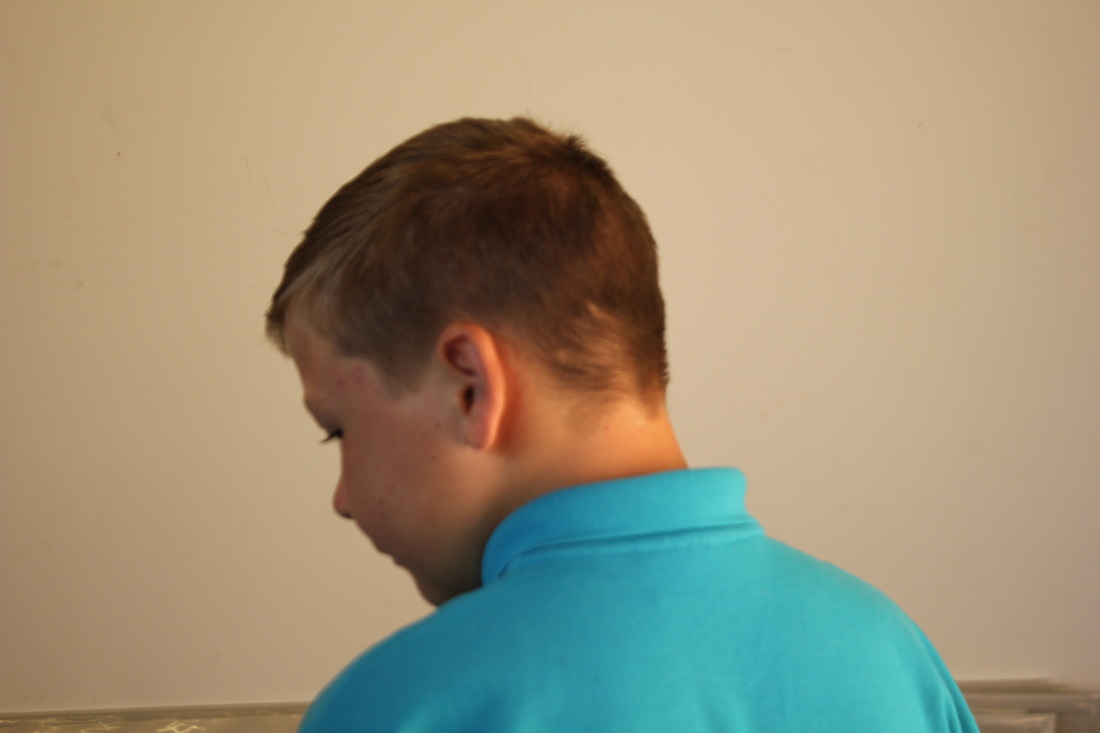
- The first picture I find quite good because it is a hair cut but also a image design and eye catching the way the top off the head is dark able to imprint the image where as the back of the neck is light and shadow and also shows contrast.
- Lastly where as the other pictures show still body postures with almost refections but transparent images behind and I personally find it imaginative and really interesting because the way it is represented it almost shows block life or just an idea someone thought off and expanded the idea and developed into a technique.
Here is tutorial I am going to use and follow to create y own kind off double exposure portraits.
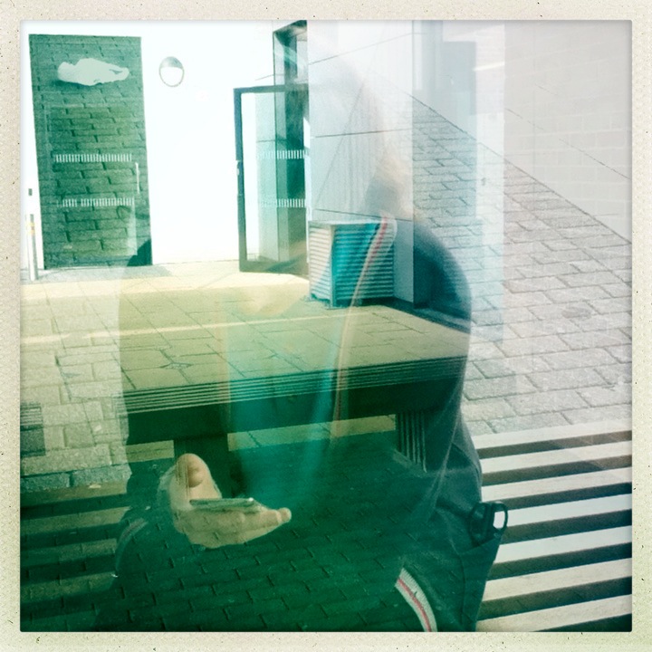
My Second Final Piece Set Of Images
My Second Final Piece
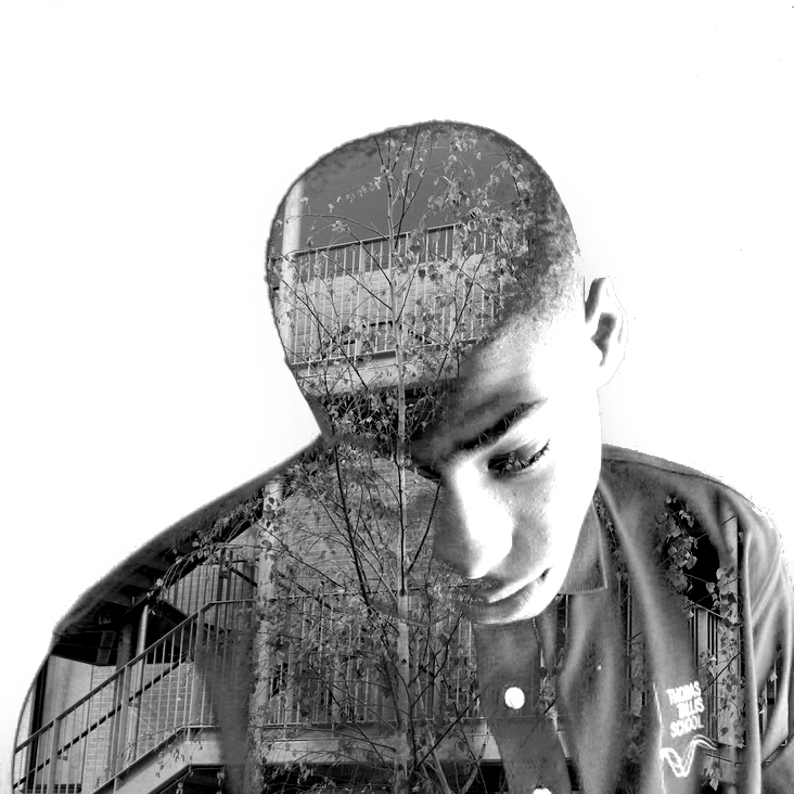
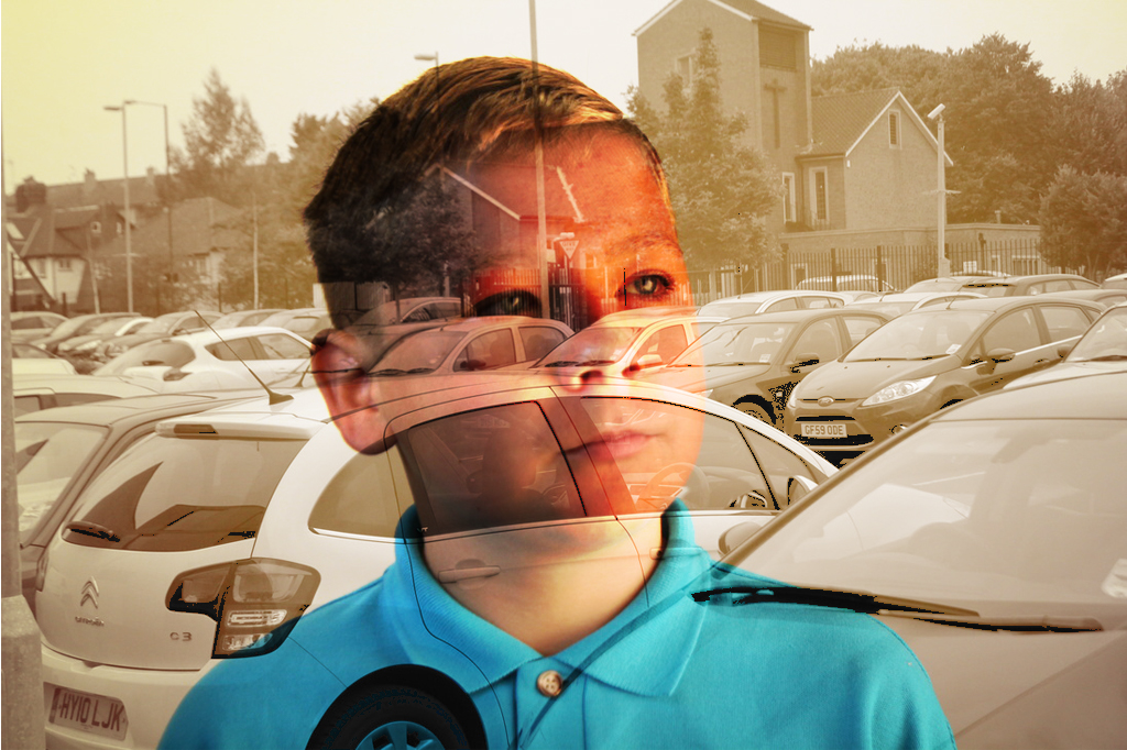
Image Set 4
Homework:
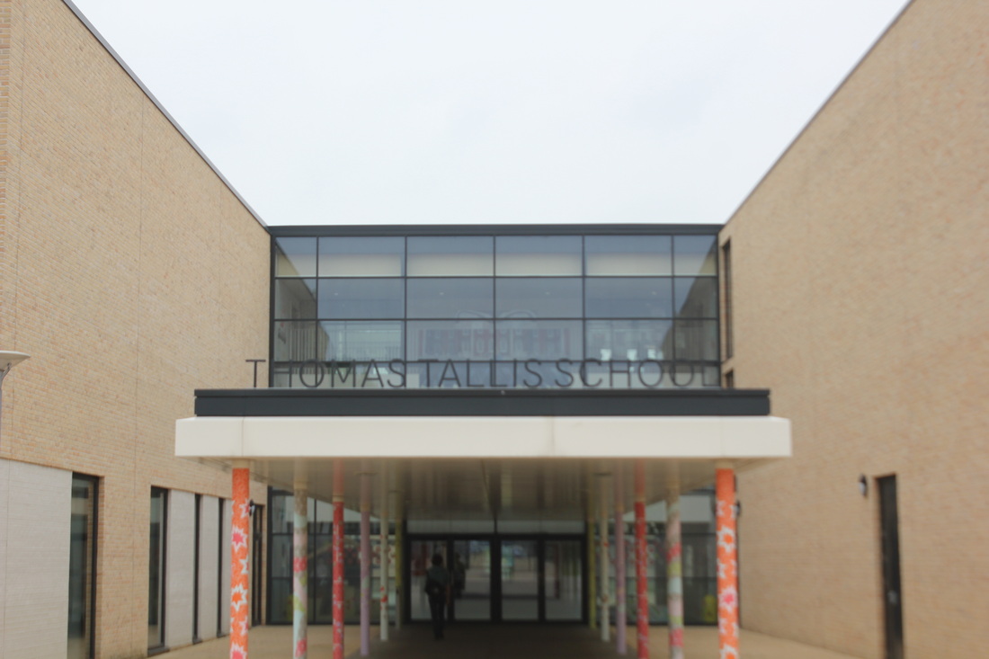
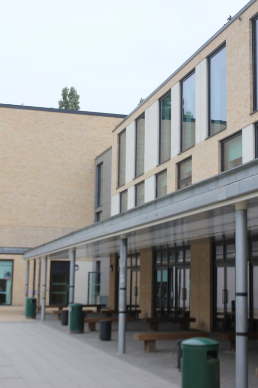
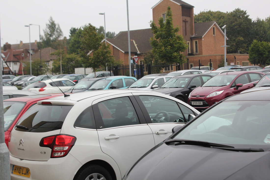
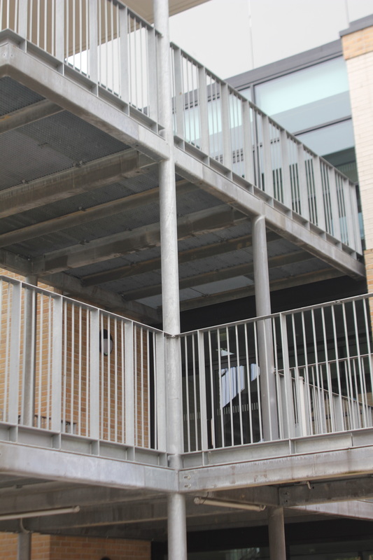
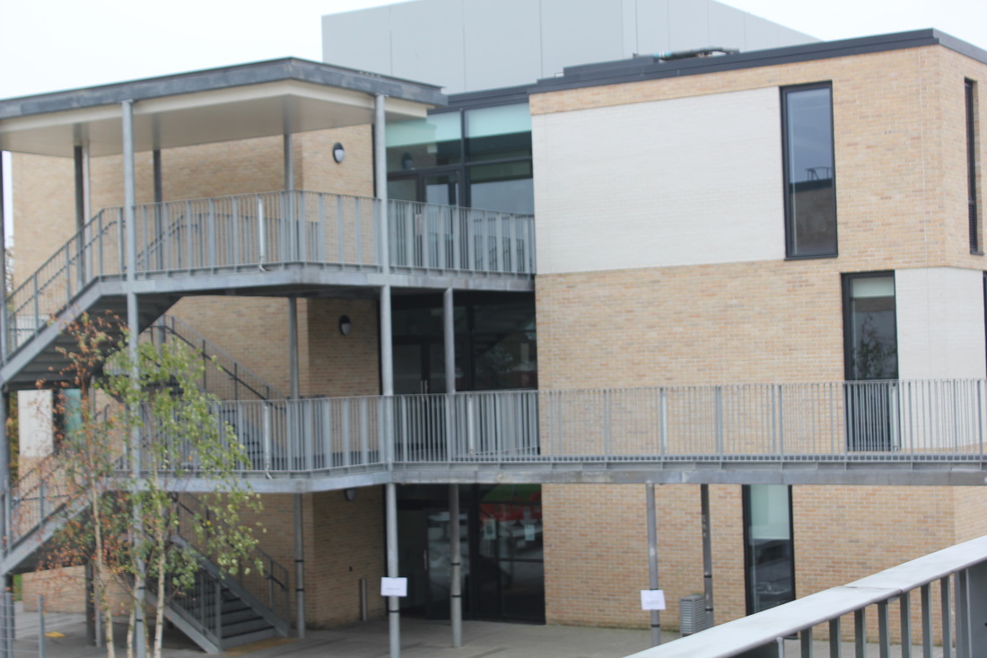
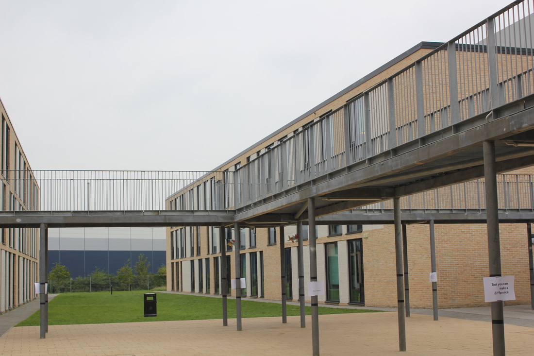
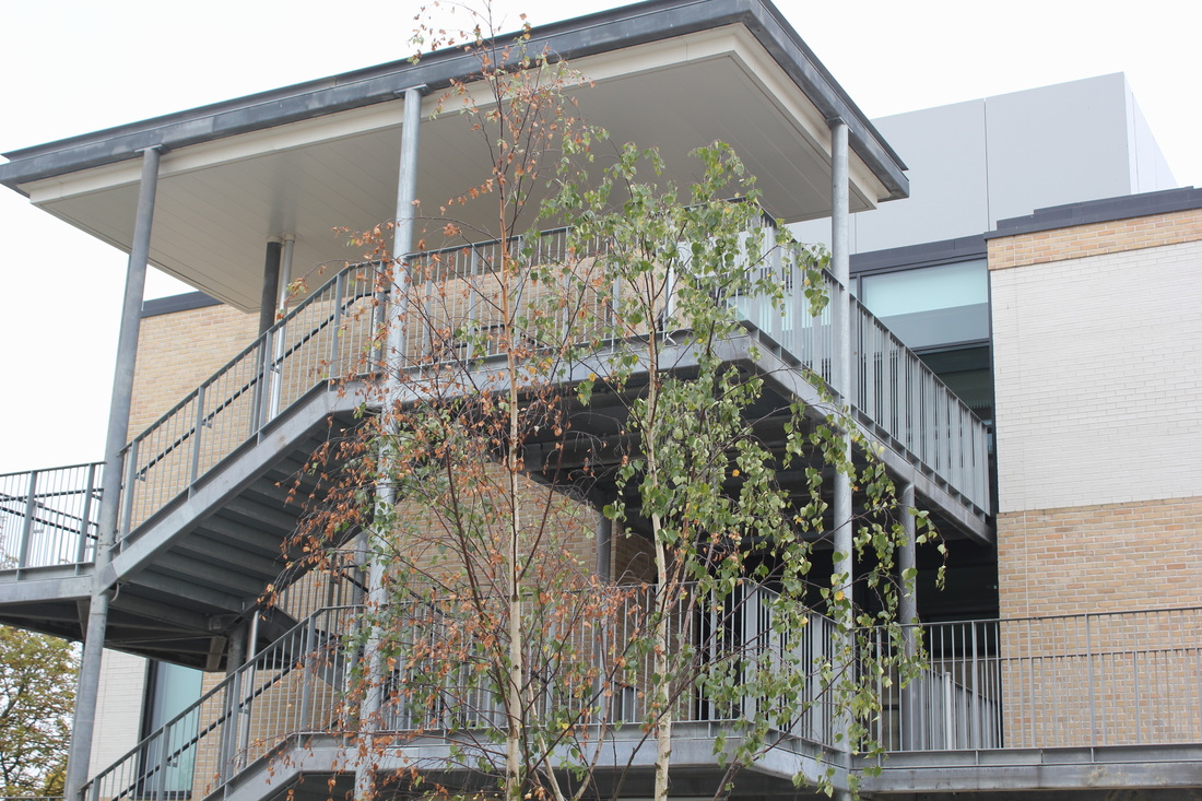
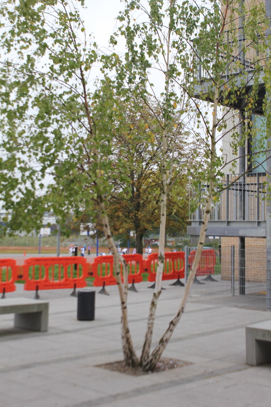
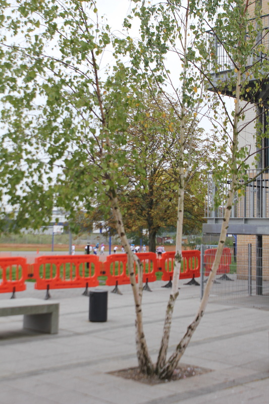
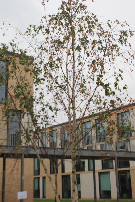
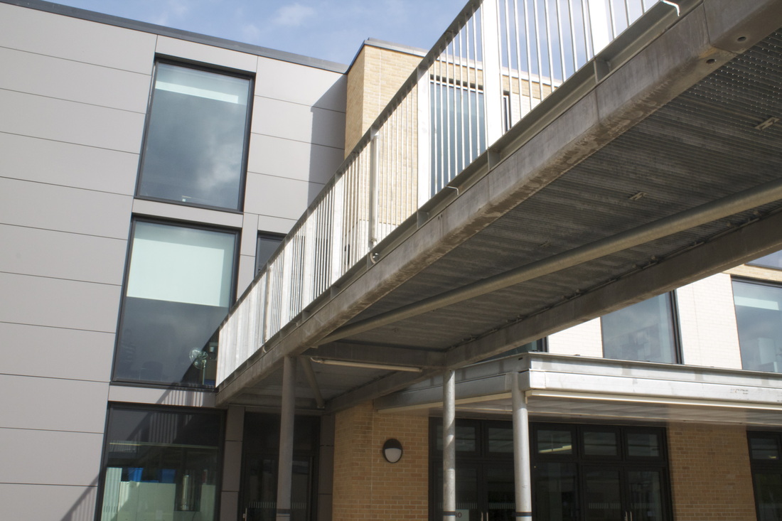
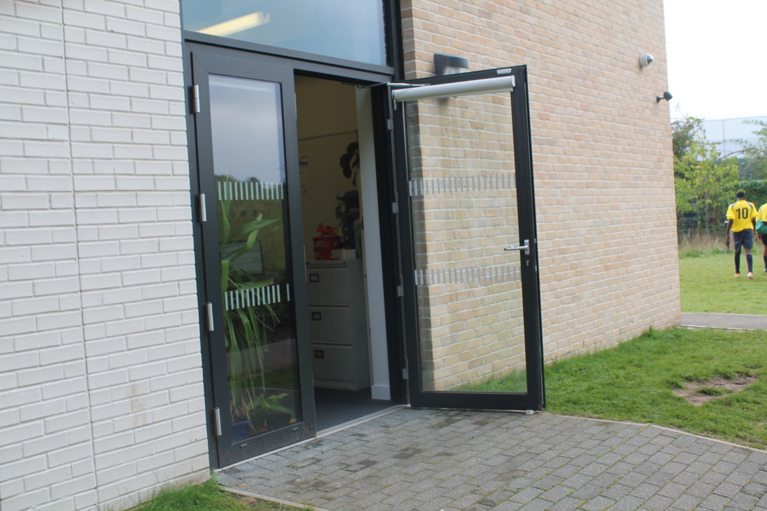
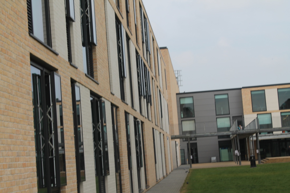
What went well is that I least I got a couple of pictures I can use and least I done the homework but other hand what would be even better was if I took more and if they was in focus , not blurred and lastly if that it was of nice buildings and in the day time.
Glitching

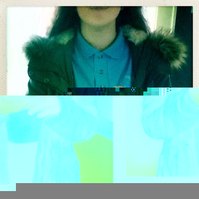
In the process you with need to get your image drag it onto you desktop double click the mouse then go onto open with - other then scroll all the way down to text edit and all the text will appear but for the glitch to work you need to least scroll half way down to see the effect. Here is a screenshots of how to do this.
Although the effects of using this glitch is that I found out and noticed that if you delete the whole bottom half the whole image fails and does not work here's an example of what happens: